The updated Scatterplot can be used to analyze advanced running and advanced cycling data channels (including Garmin Cycling Dynamics and Running Dynamics) as well as muscle oxygen saturation (SmO2) data.
You can find out how to add the Scatterplot chart to your Expanded Workout view window here. Note that you can add as many copies of the Scatter graph as needed and configure each to display separate data channels.
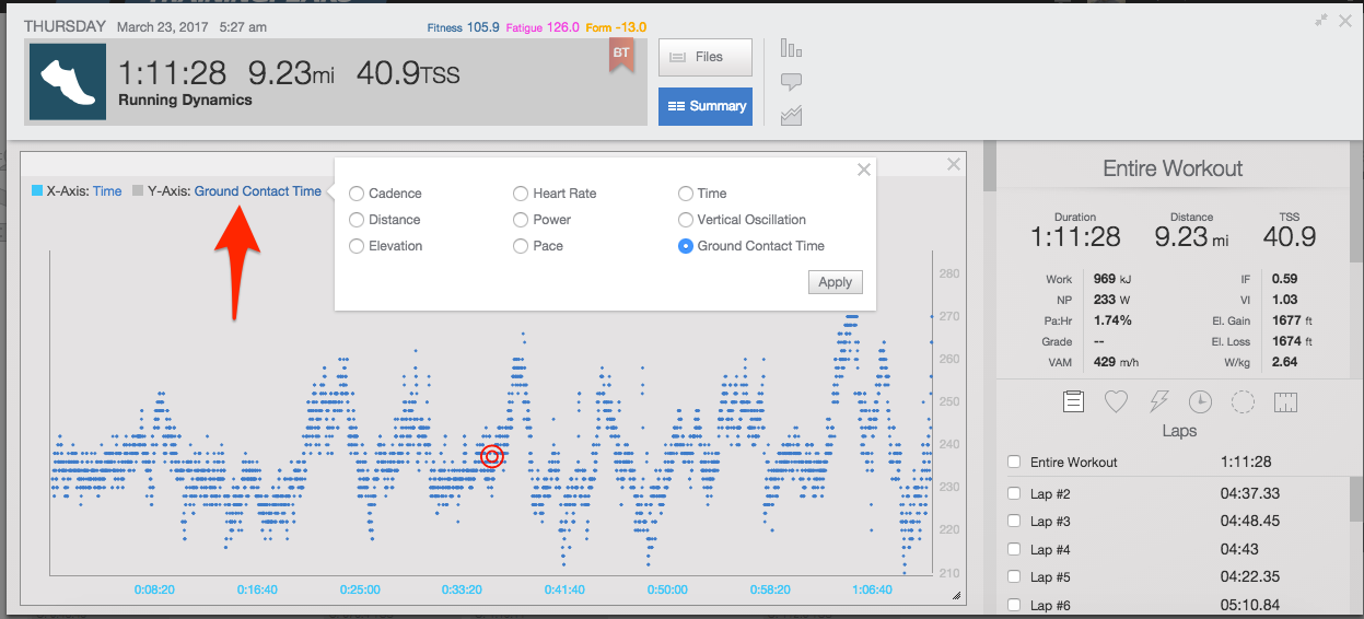
Once you have added the Scatter graph to the Expanded Workout view you can configure it by clicking on the name of the data channels for the x- and y-axes to see the available options for that workout. To see how a data channel changes over the course of a workout similar to the basic Horizontal Workout graph you can set the x-axis to either time or distance.
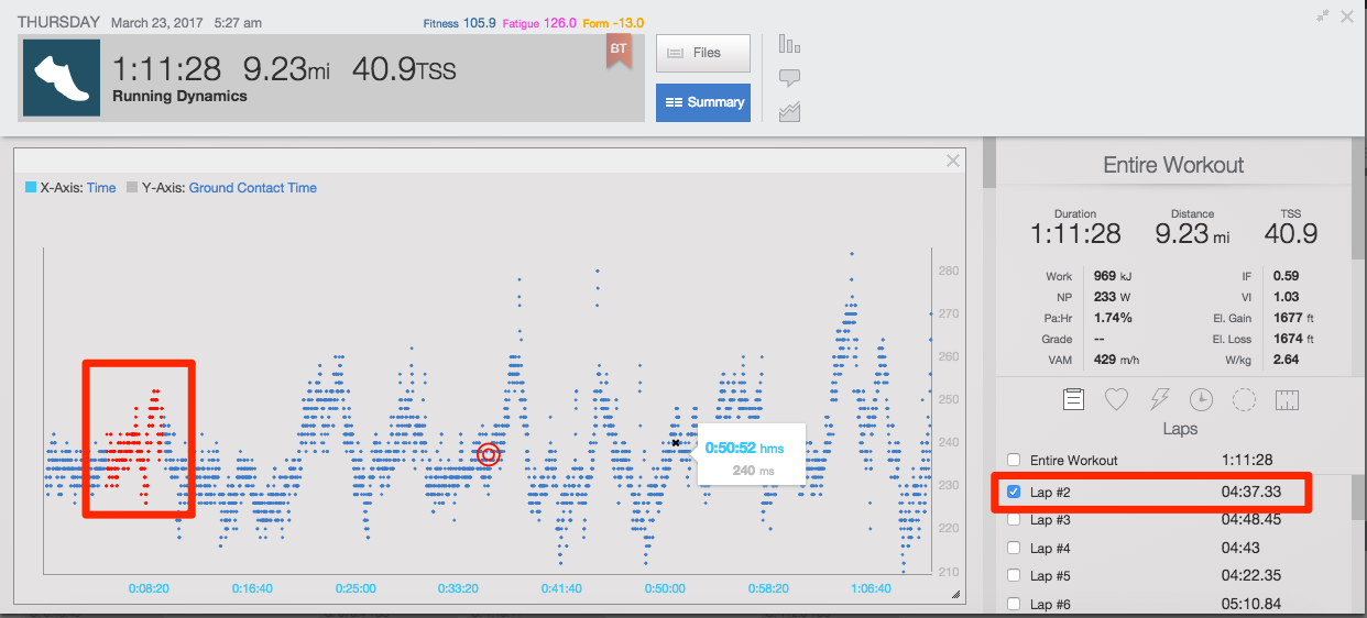
You can see the details of a specific data point by hovering your mouse pointer over the data point on the chart. The red circle icon position indicates the average of each of the selected data channels. Selecting laps in the right hand list of laps will highlight the corresponding data points on the Scatter graph.
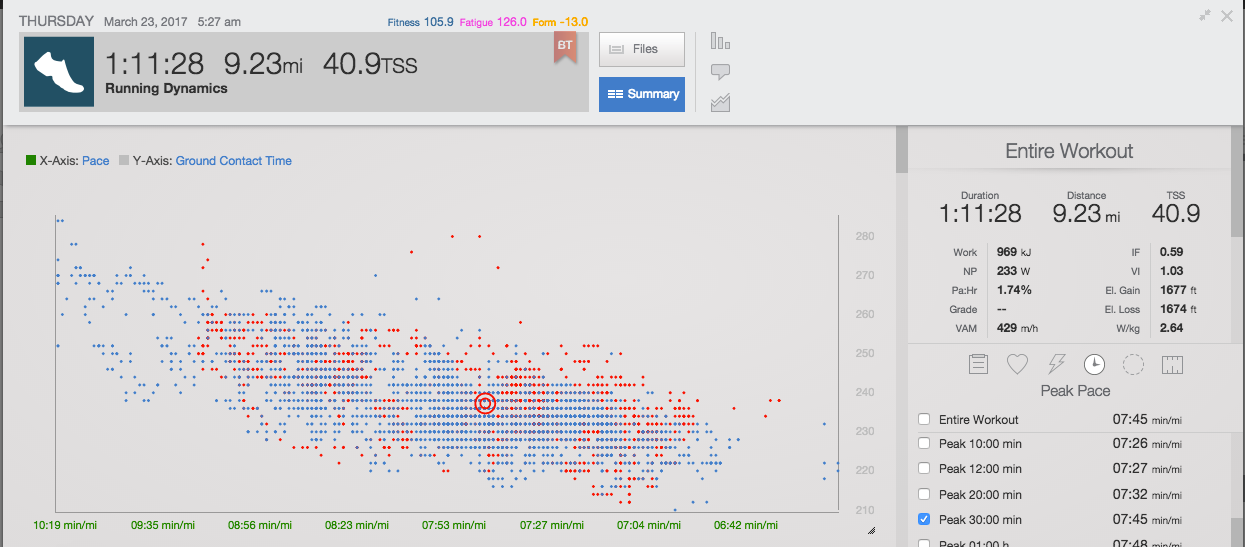
In addition to viewing a giving data channel over time, you can compare to data channels to each other. For example, to see how Ground Contact Time changed as you or your athlete changed their pace during a workout.


